How many times, looking, for example, at the logos of Nike, Adidas or Apple, have we asked ourselves just one question: “Well, couldn’t we have drawn such a simple logo ourselves?” If yes, then let’s move on reading. If not, we still move on. How many times have we read the news that some famous design studio redesigned the next big corporate logo for a check with an obscene number of zeros, and in the end just made the font thinner or simply reduced the distance between some details?
And so, every time we read such news, we come across dozens, if not hundreds of comments that the designers simply scammed their clients for money, but actually nothing in the logo has changed. In fact, as is often the case, things are not so clear cut.
Firstly, the famous swoosh was most likely a manifestation of spontaneous genius insight (for which, however, they paid only 35 bucks), and the original version of the Apple logo was complex, artsy and as old-school as possible. Secondly, any change in the logo in a large company is preceded by a long and thorough marketing analysis. Yes, sometimes it turns out a complete fail, as was the case with the 2012 Summer Olympics logo, but more often than not, the idea of saving on logo design doesn’t justify itself at all.
Do you want proof? Voila! As many as 47 examples collected by Bored Panda, when the designer just drew something, the marketing manager was either absent or did not think at all, and the boss approved the logo without looking. And the result is what we have – this incredible selection of logos from around the world, on the one hand, beautiful and stylish – but completely inappropriate, you just have to look at it from a different angle. So please feel free to think different, as Steve Jobs once urged us, scroll this selection to the very end, and just enjoy these absolute masterpieces of human short-sightedness.
#1 Now That’s Just A Bad Logo. Period
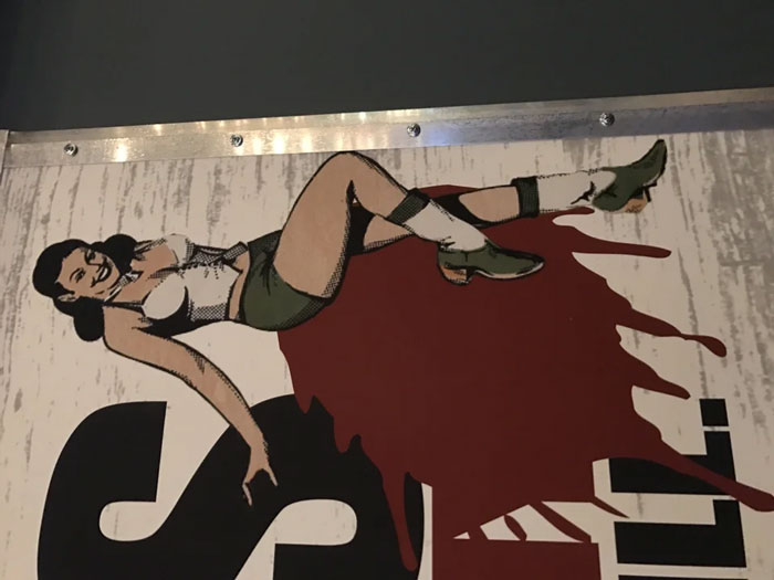
Image credits: u/ZuesAndHisBeard
#2 This Catholic School Logo
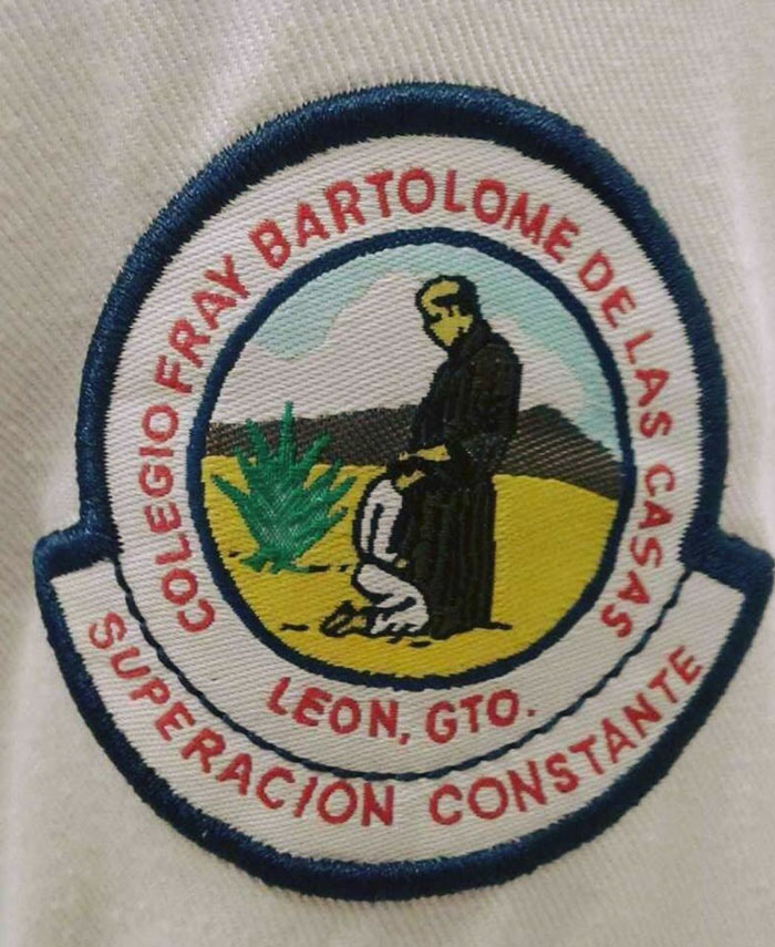
Image credits: u/Jaggyjags
#3 The Logo For This Spicy Apple Jelly
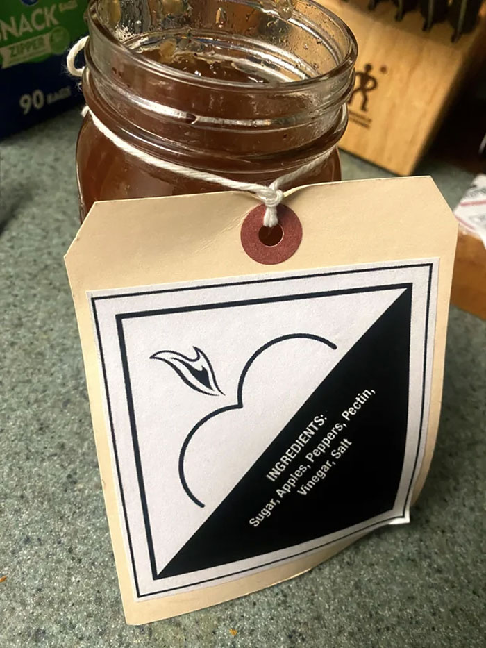
Image credits: u/KyleColby
#4 This Medical Centre’s Logo Is A Flat Line
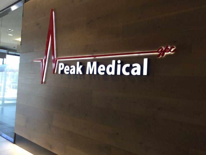
Image credits: u/izyzacov
#5 Not The Greatest Logo
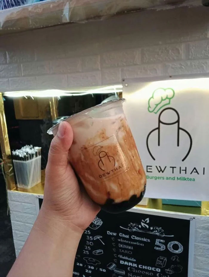
Image credits: u/1aappyy
#6 Unfortunate Door/Logo Placement On This Plane
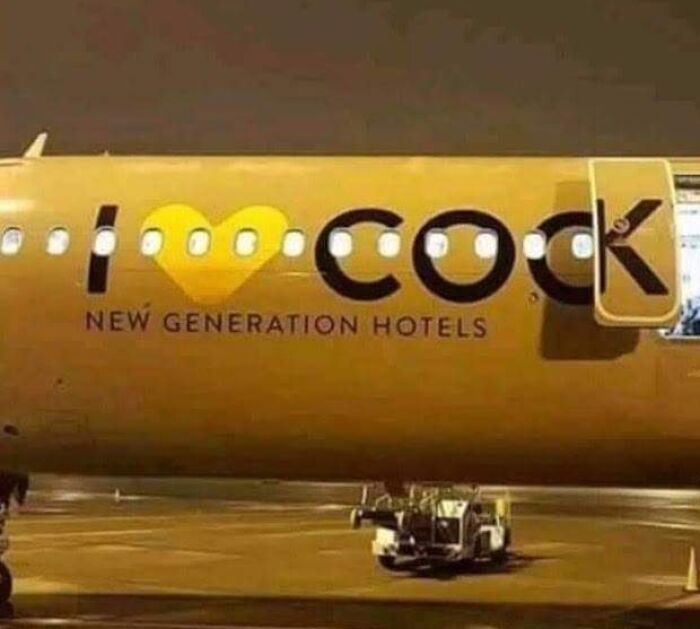
Image credits: u/nthensome
#7 Whoever Designed This Logo Made A Terrible Mistake
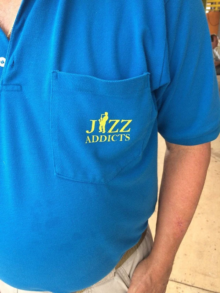
Image credits: u/j1002s
#8 An Unfortunate Logo For A Fitness Center
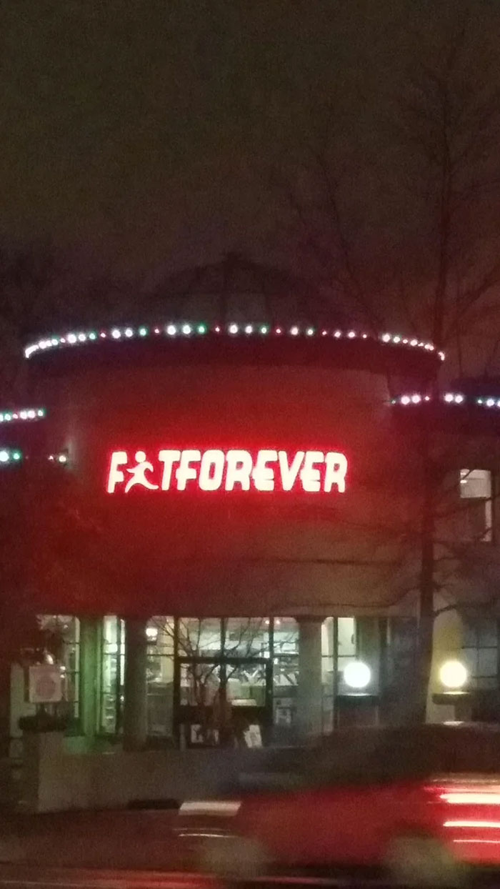
Image credits: u/Dingwallace
#9 Girls’ Water Polo Team Logo
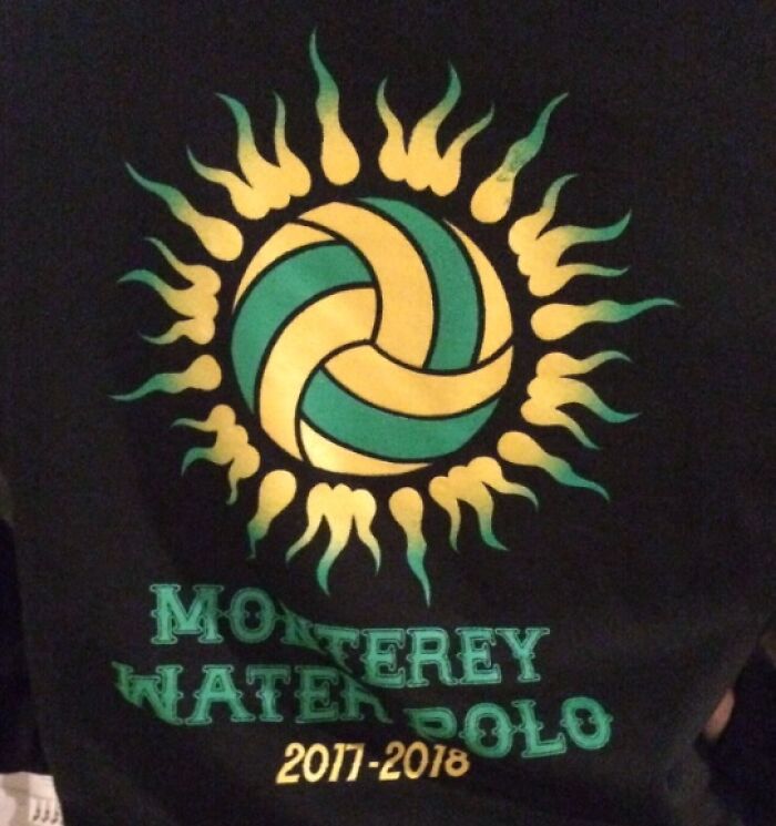
Image credits: u/Bacicot
#10 My Son Who Just Started To Read, “Hell Baby. Hell Baby. Hell Baby!!!”
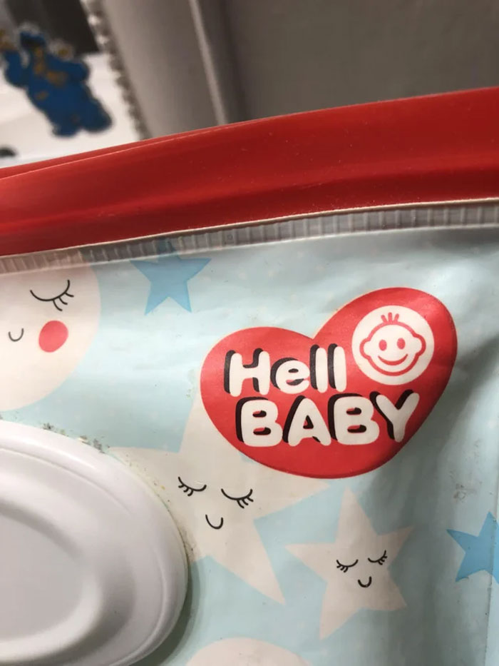
Image credits: u/Hopeful_Relative_494
#11 A “Cheerleading” Logo In A Town Close To Me
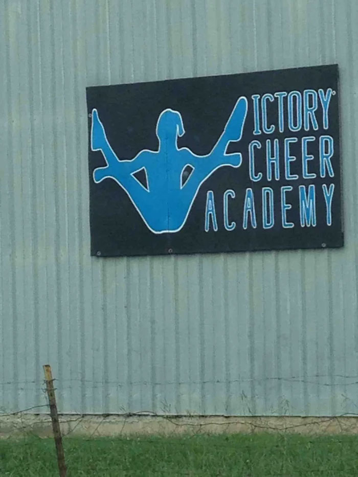
Image credits: u/Pmray23
#12 This Restaurant’s Logo That Looks Like A Health Grade
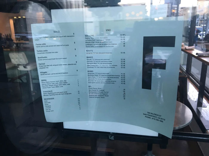
Image credits: u/drobinow
#13 This Yogurt Using Biohazards Symbol As Its Logo
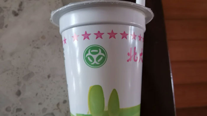
Image credits: u/ShermanLiu
#14 Designer: Can You Describe The Logo You’d Like? Client: It Should Have A Leaky Pipe. But Instead Of Fixing It, Our Plumber Just Puts His Finger In There. And Btw, It Should Still Leak After He Does That
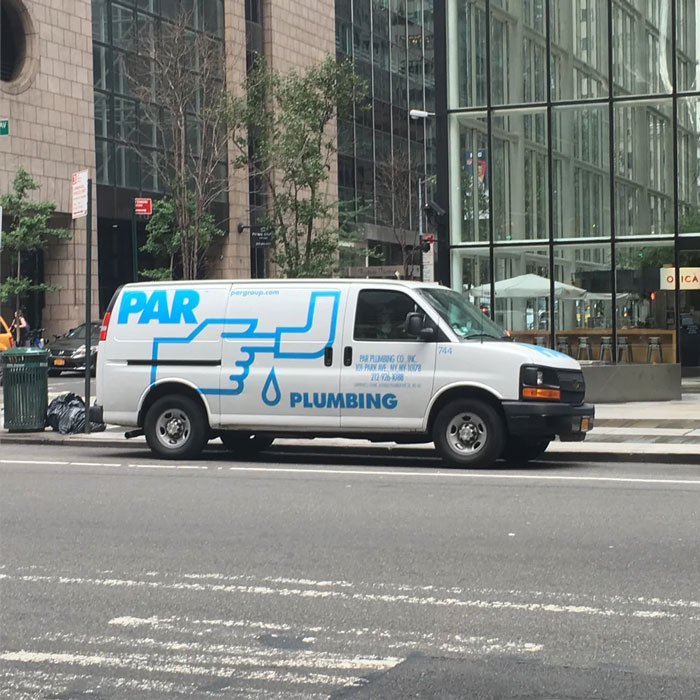
Image credits: u/nickrosener
#15 Design Of The Bottle And Logo Looks Way To Close To A Sunny D Like Drink. If A Kid Couldn’t Read This Would Go Bad
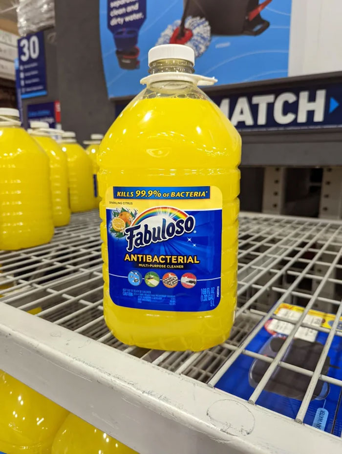
Image credits: u/TheElegiast
#16 This Company’s Logo Looks Like Somebody Got Pulled Into A Lathe
Image credits: u/Marc815
#17 I Love Drinking Kids Too!
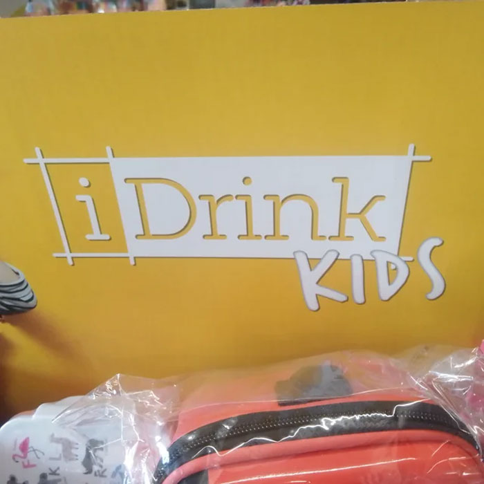
Image credits: u/RosenRanAway
#18 Was Stuck Behind This Unfortunate Logo Today
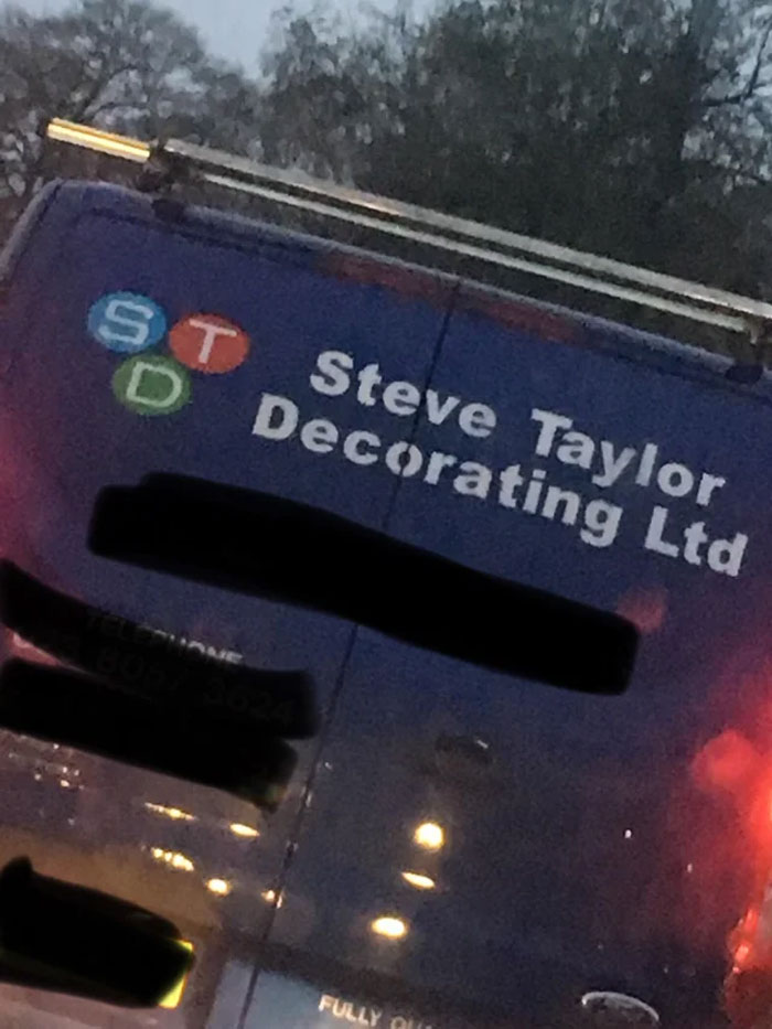
Image credits: u/Jackarewb
#19 The Flip Zone Has A Rule Of “No Backflips” When There Is Literally A Guy Backflipping In The Logo
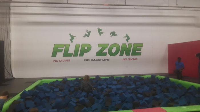
Image credits: u/Xx_BaconPlays_xX
#20 It Really Feels Like The Packers Logo Could Have Replaced A Different Letter Here…
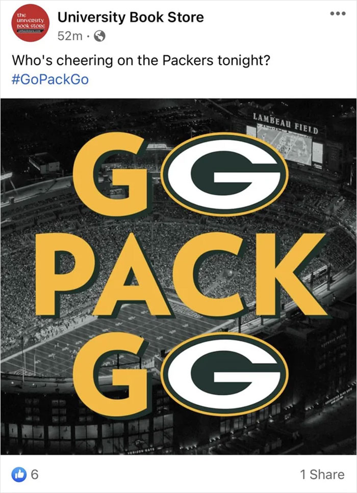
Image credits: u/J_Mart29
#21 A Clothing Tag With Unfortunate Logo Design
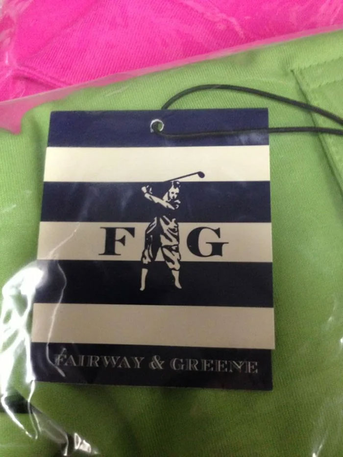
Image credits: u/Samheim
#22 We’re Going To Contact Them With A New Logo Hopefully
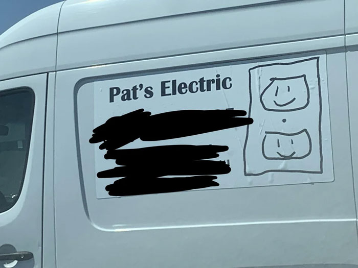
Image credits: u/lefuturtle
#23 They Really Need A New Logo
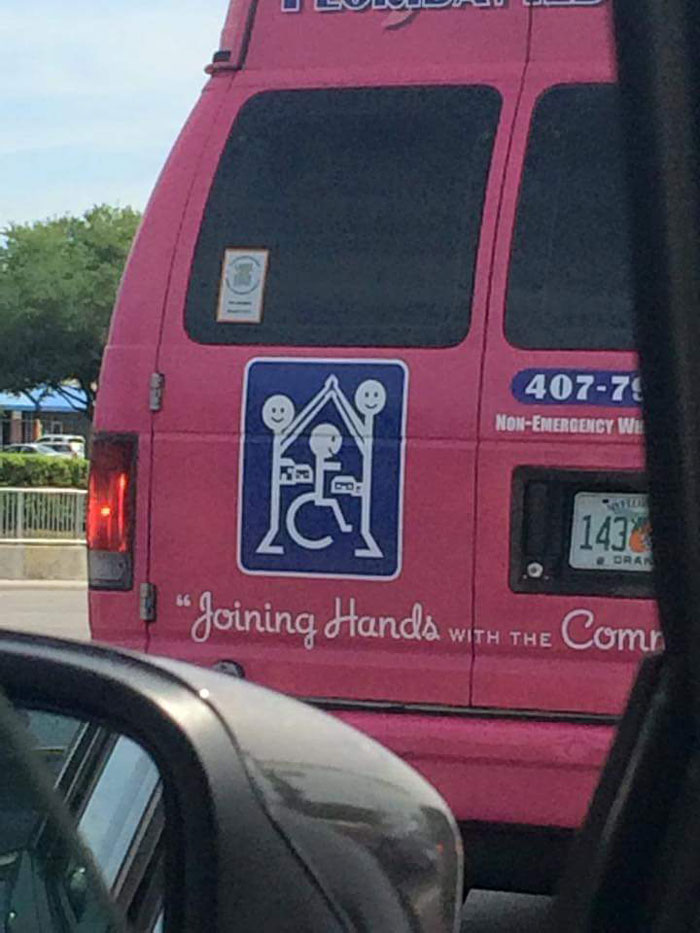
Image credits: u/ForeverInaDaze
#24 Prizes On Offer At The Clinic
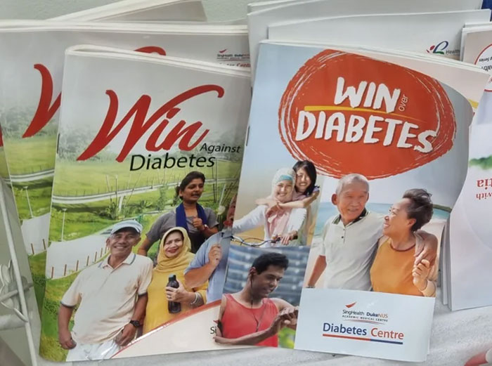
Image credits: u/BaronVonStretchmark
#25 This Logo Of A Turkish Water Brand
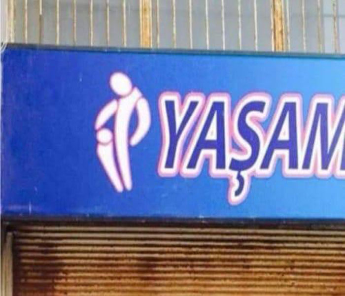
Image credits: u/sercan35
#26 Ride On Spac Eship
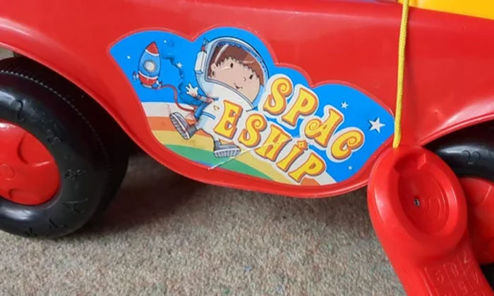
Image credits: u/pruaga
#27 The Tim H*e Use – Supposed To Read ‘The Time House’
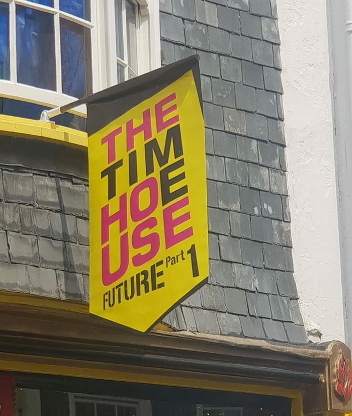
Image credits: u/Big_ElMo
#28 This Logo Of A Company In My City
Image credits: u/Fulla_good_stuff
#29 Just Another Restaraunt Logo That Was Edgy And Cool In Someone’s Head. Spotted Near My Gym, Midtown Manhattan
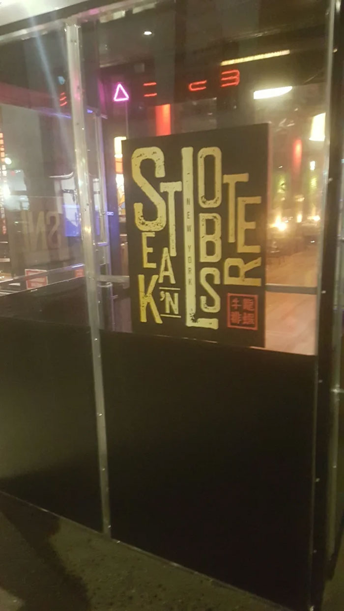
Image credits: u/m13131313
#30 Welcome To Devil’s… Alvoole? Elvccle? (Advocate). I Like The Idea, But The Execution Is Not The Best
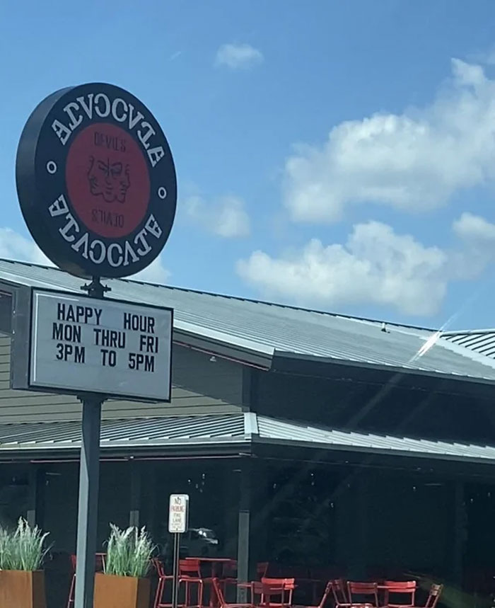
Image credits: u/mantiseses
#31 This Sign In The Office Building Where I’m Attending Training
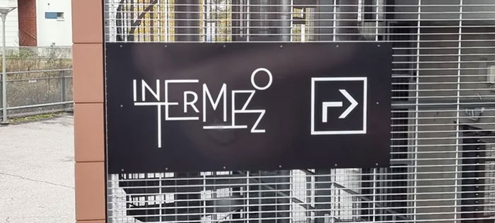
Image credits: u/Autiosaaren_lautturi
#32 This Pub Is Supposed To Be Called “Bunch Of Grapes” And I Saw This Unreadable Logo And Asked My Mate “How Far Is The Pub Then?”
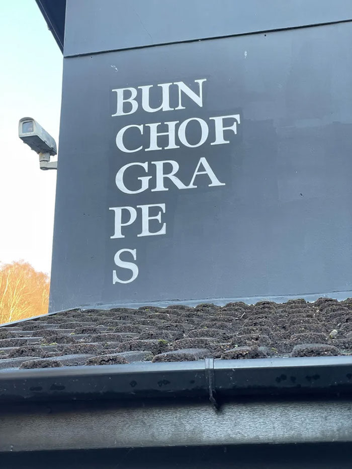
Image credits: u/isaac-jones
#33 This Horrific Cafe Logo
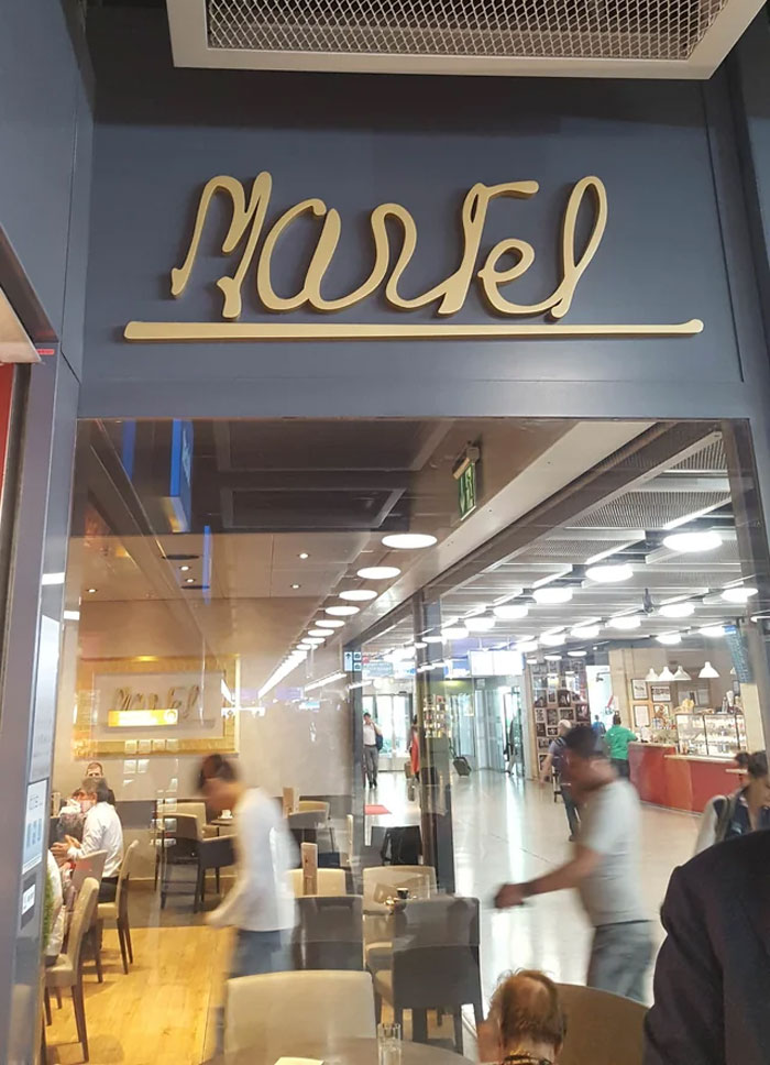
Image credits: u/Andrew_Reynolds
#34 This Logo For “Old Town North”
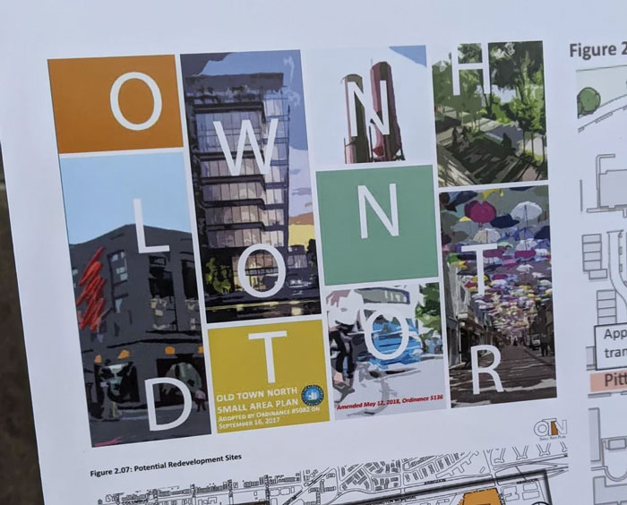
Image credits: u/KittyLikesTuna
#35 The Second Line Of This Logo Did Not Age Well
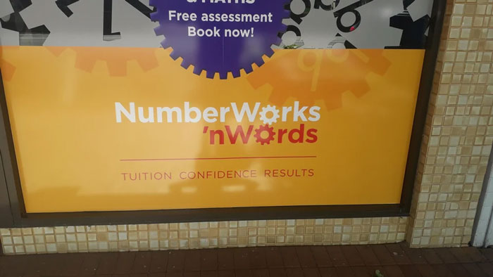
Image credits: u/HellaGayAli
#36 3lje Or Blue?
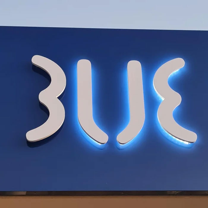
Image credits: u/FedUpFrog
#37 Found At The Austin Airport – It’s Texas Like!
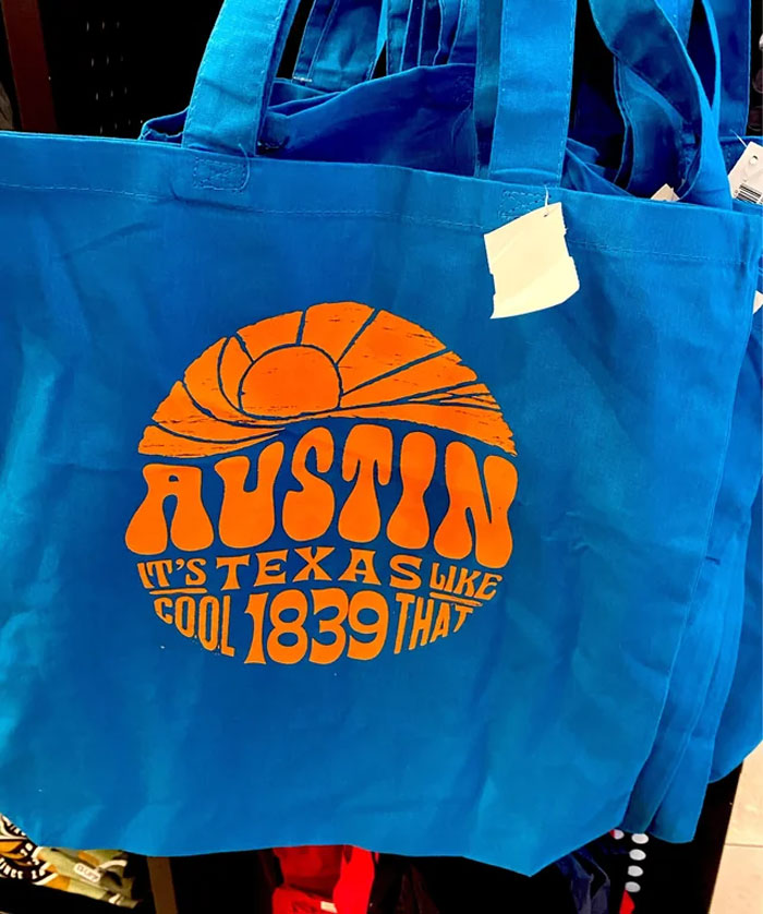
Image credits: u/Sophie_e_m
#38 Chonoo Zendle Noodle Bar
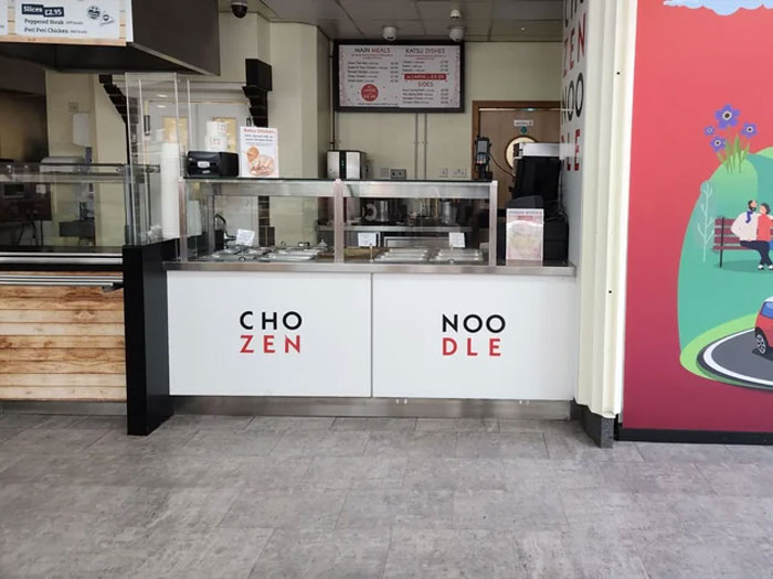
Image credits: u/Kchind
#39 They Didn’t Think Their Logo Design Through Too Well
Image credits: u/cthulhuscock
#40 Jingleheimer Junction, Cartridges For Kids Logo
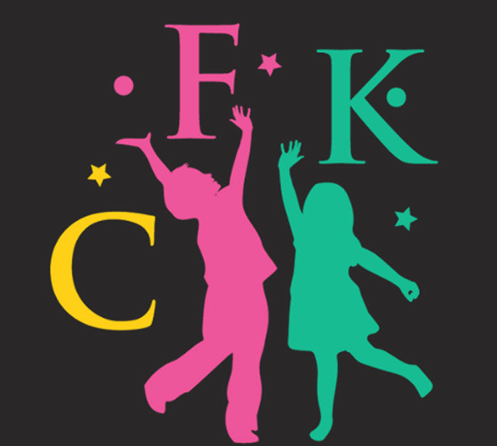
Image credits: u/maldehyde
#41 There Is An Extra “R”, Normal Name Is Chuck Burger
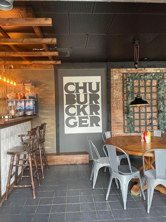
Image credits: u/quusky
#42 The Actual Logo Of A School Near Me
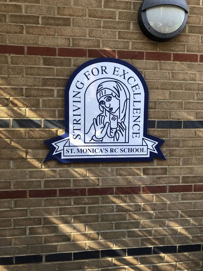
Image credits: u/MagL33To
#43 Ole Let Y, No Matter How I Read This I Will Always Have Questions
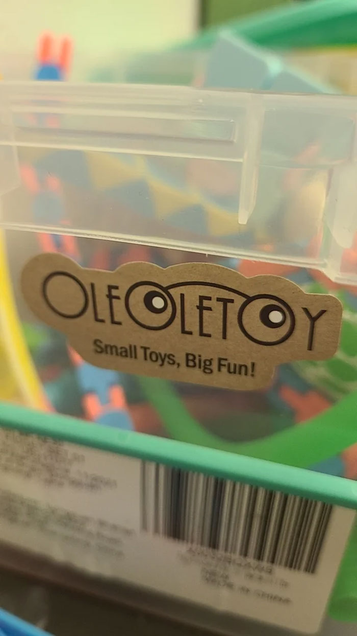
Image credits: u/Tall_Technician_6834
#44 Ke Lebab. Restaurant In Stockholm
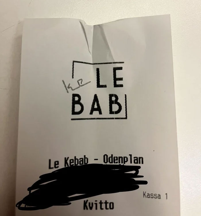
Image credits: u/Kalle__Kula
#45 Saw This At My Local Heb. It’s Supposed To Say “Frescura” (Freshness)
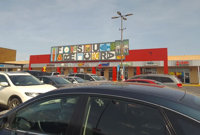
Image credits: u/setfna
Go to Source
Author: Monika Pašukonytė