There’s good design. There’s bad design. And we can usually intuitively tell the two apart just by looking at it. But wait! There’s also ‘design design,’ a really weird category that straddles the line between quality aesthetics and truly awful taste. Some designers just don’t know when to stop designing their designy designs and go way overboard. Are we starting to sound redundant and over-complicated? Good, now you’re getting it!
The best (worst?) of these ‘designy designs’ end up being shared on the r/DesignDesign subreddit, an intriguing online community that both celebrates and criticizes these errr VeRy InTeReStInG aNd ArTiStIc ideas for products and furniture. We’ve collected some of the most bizarre and original pics to share with you, Pandas.
Scroll down, upvote the designs that really had an impact on you, and if you love what you see, consider becoming a member of the subreddit.
Bored Panda reached out to Matt Johnson, Ph.D., the host of the Consumer Psychology Blog and the Human Nature Blog, for a few insights on the importance of finding the right balance between the designer’s vision for their product, as well as what would appeal to consumers. He told us that, at its core, user experience is about empathy. Johnson is a professor of consumer psychology at Hult International Business School and Harvard University, and the author of ‘Branding that Means Business.’ Read on for our interview with him.
#1 Wall Outlets With Extension Cords Built Into The Wall
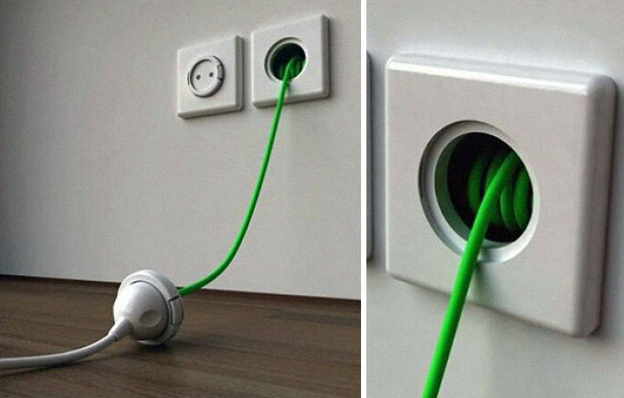
Image credits: joeepeterson03
#2 Stacked Seating At A Restaurant
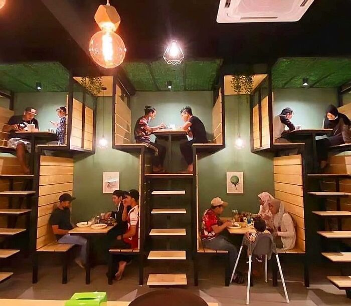
Image credits: Xerxes2004
#3 Found On The Designp**n Frontpage
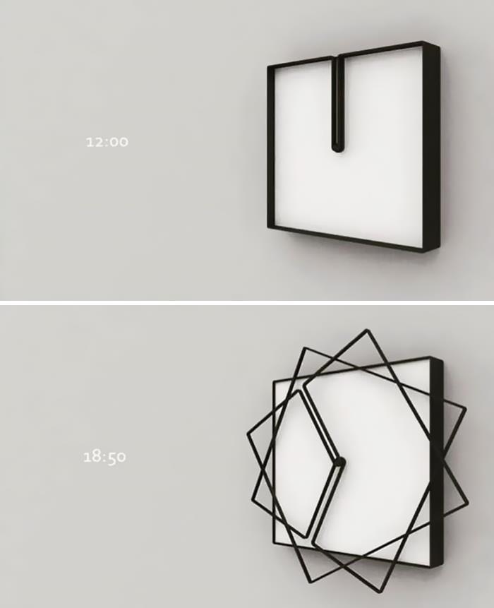
Image credits: Ryzasu
We were interested to learn more about the balance between what a designer wants from their product and what consumers look for. We asked Professor Johnson about what can help designers maintain a more grounded, user-friendly perspective.
“Ultimately, good UX is an act of empathy. You have to filter your creative vision for the product through the lens of the consumer’s needs, unique preferences, and tendencies. This means creating a balance between your own aspirations for the product (e.g. what you think it could be), and how it will intuitively seem to the end user (how the user will actually be used),” he explained to Bored Panda.
“Practically speaking, by inviting the consumer into the design process and getting feedback along the product development journey, the end result is much more likely to strike this balance.” However, if there’s only poor communication, you might end up with a disconnect between the two. Something that Piterskii-Punk-Wall accurately showed in their comic right over here.
#4 Hidden Fire Extinguishers
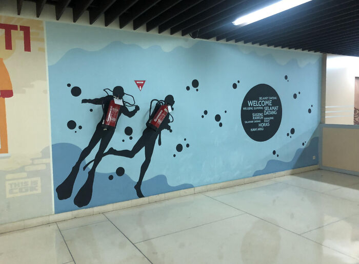
Image credits: peter-s
#5 A Nature Inspired Bathroom
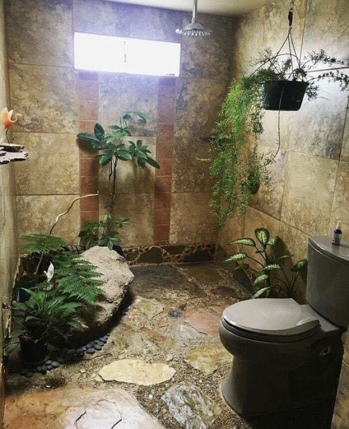
Image credits: TheBrontosaurus
#6 Drink The Rainbow
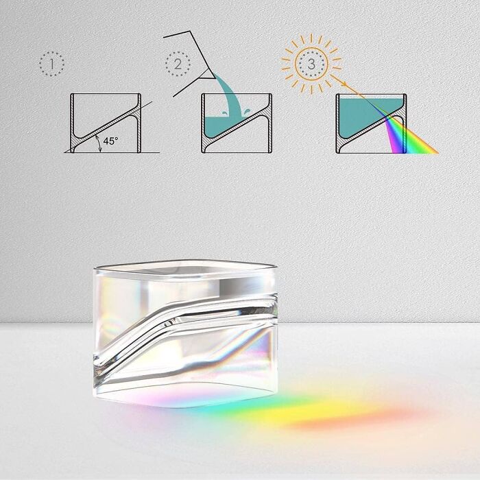
Image credits: AgainstTheAgainst
Johnson, the host of the ‘Neuroscience Of’ blog, told Bored Panda that the best and most beloved products integrate both perspectives: that of the designer, as well as of the consumer.
“If the balance is tilted too far in the direction of the creator’s vision, as opposed to the user’s intuition and needs, it comes off too much as a standalone work of art, and not as a functional product,” he said.
“This feels immediately obvious to the consumer: it’s something that reflects an idea from a specific individual, but lacks the necessary translation to the broader world. In a word, it feels too much like ‘art,’” the professor told Bored Panda. He noted that this is perfectly fine and valuable in its own context. However, when it comes to the world of consumer products, there’s a necessity for this additional layer of consumer empathy.
#7 Ok I Think I Found The Ultimate Decanter. This One Keeps Me Awake At Night
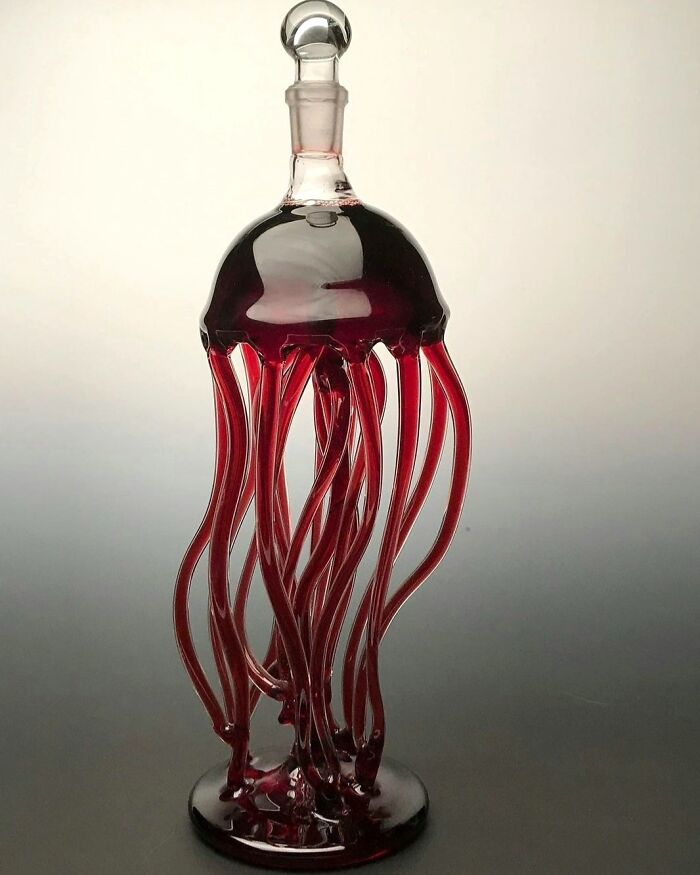
Image credits: living_legend6
#8 Door Knob Design That Gives You A Fish Eye View Of The Room Ahead
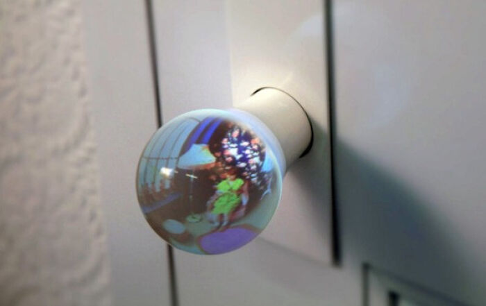
Image credits: Immortalizd
#9 Imagine Going Through All The Trouble Of Publishing Just To See This
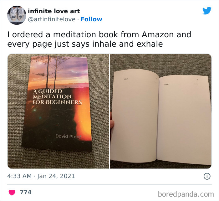
Image credits: unicodePicasso
As we see it, there are two main issues at play here when we’re talking about designy designs, aka over-designed products. Both explain, at least in part, why some creative professionals go completely overboard.
The first is a question of theory vs. practice and how even the best-laid plans don’t necessarily translate into reality. The second is about the relationship between the designer and their (real or imagined) audience—aka the end-users and consumers.
You might have an utterly amazing idea for a product or piece of furniture in your mind. Maybe you’ve even sketched it out! But even though the concept looks amazing on paper, it might not be the best fit for consumers. Something that any creator would be terrified to learn only after launching the idea into the market.
#10 Another Silverware Set… Another Useless Spoon
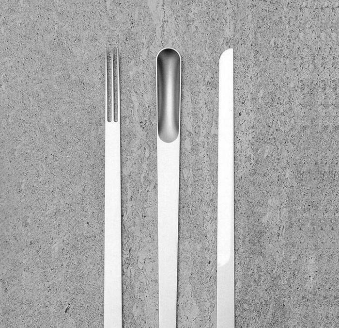
Image credits: elrolo123
#11 Possibly One Of The Worst Staircases I’ve Ever Seen
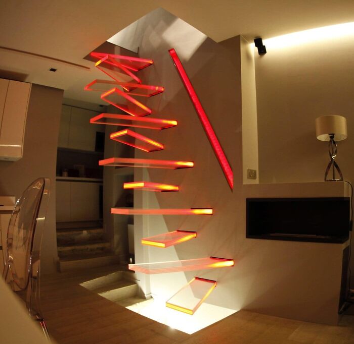
Image credits: FastGinFizz
#12 Swinging In The Conference Room
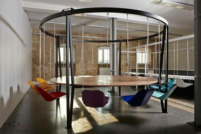
Image credits: Dr_Zol_Epstein_III
Maybe what you’ve come up with is more akin to art and is radically impractical to use every single day. Or the item is incredibly complex and unintuitive to the average shopper on the highstreet: something that you might not realize because you’ve spent so long on the design, you know it like the back of your hand. It’s a case of design short-sightedness where the professional can’t see the forest for the trees.
Meanwhile, the professional in charge of designing the product might be completely disconnected from their intended consumers. This might happen due to a lack of information on buying trends or because of less-than-stellar communication between them and their customers. That means that the designer is essentially stuck inside a bubble with only their own ideas to consider, with very little (if any!) outside feedback.
#13 Holy F**king S**t
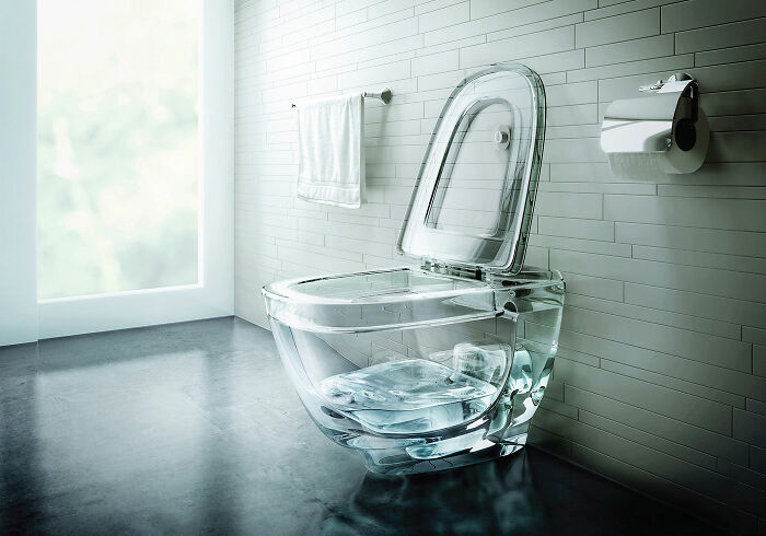
Image credits: reddit.com
#14 No Way This Can Go Wrong
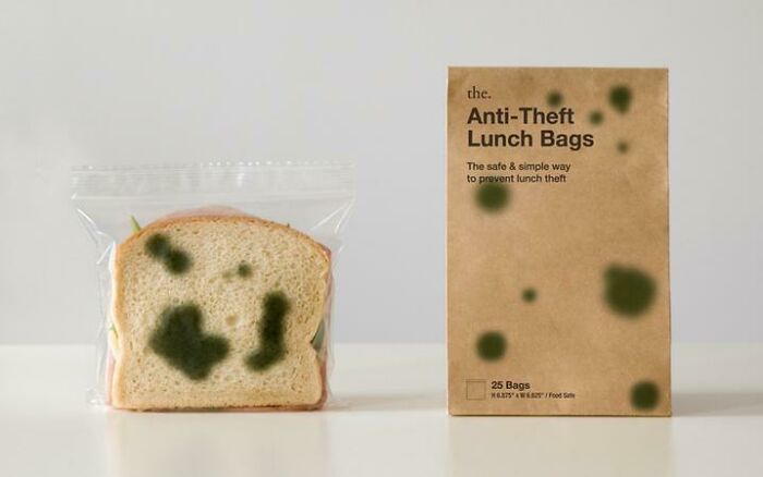
Image credits: R1m1s4k
#15 A Banana Slide That Trains Your Determination. If You Get Lost, Your Crotch Will Die
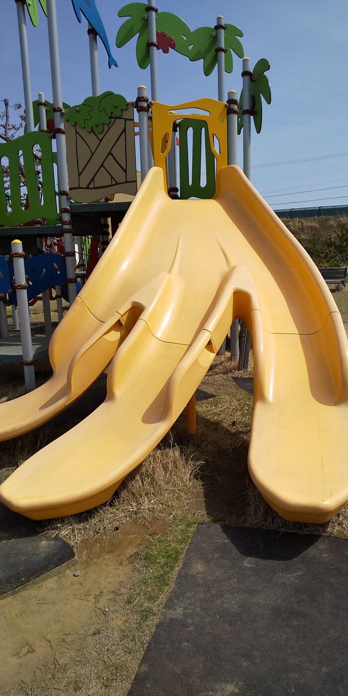
Image credits: DonnySRT-10
However, another possible explanation for this disconnect between designers and consumers can be attributed to a more human factor. Namely, arrogance. It’s perfectly fine, even praiseworthy, that you’re confident about your work and that you feel pride in what you’ve achieved. Unfortunately, this can sometimes overshadow the end goal of what’s being sold, namely, that people want to buy and use what you’re offering.
Perhaps the creator feels like they have far better taste than the would-be buyers. So they want to ‘enlighten the masses’ (or something equally as pompous). Here’s the thing, though. Even if it’s a well-intentioned idea to want to educate people about good taste, there are different ways to go about it.
To put it mildly, it’s not the best idea to go about bragging to everyone how much more educated and intelligent you are while poking fun at them for being tasteless. However, when you come from a place of humility and a genuine desire to help, others are more open to what you have to say.
#16 A Car Fender Bicycle
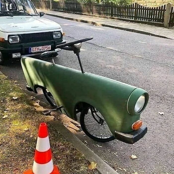
Image credits: VOTROI
#17 Apartments In Amsterdam
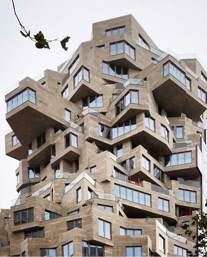
Image credits: spitzyyy
#18 Injury Attorney’s Dream Staircase
Image credits: CaptainCaptain17
At the same time, no matter how successful and well-received a designer’s work might have been in the past, it doesn’t guarantee that their next idea will be good. Multi-functional furniture might not have the mass appeal that they hope it will, meaning it’ll remain a niche product for very niche buyers.
Similarly, even if your lovingly-crafted set of cutlery is pleasant to look at, it might be utterly atrocious to eat with, so you’re left with a decorative piece that very few people actually like.
#19 Imagine What It Looks Like In Fall
Image credits: VexuBenny
#20 This Is The New University Building Of Freiburg That At The Same Time Blinds The Road Traffic
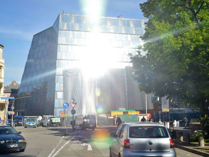
Image credits: schalker1207
#21 Just No
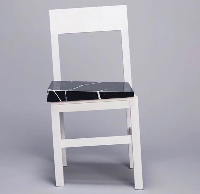
Image credits: Grown_Ass_Kid
The r/DesignDesign subreddit was founded a few years ago, in mid-July of 2018. Since then, they’ve amassed a following of 120k redditors. The moderators running the whole show stress the fact that the pics shared by the members of the community have to be, at the same time, examples of good and awful design. There should be a balance between the two.
#22 Books And Bath
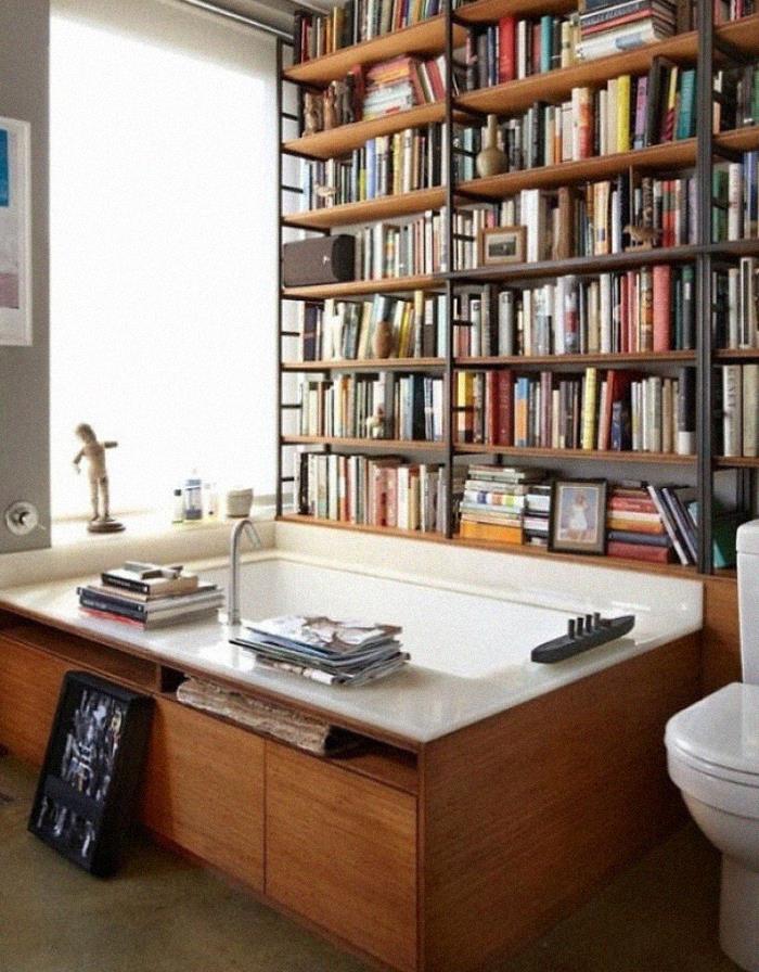
Image credits: hannahwith
#23 Just No
Image credits: DavyBoyWonder
#24 Found On Fb… I Can Hear This Image
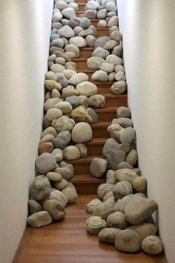
Image credits: 12welveCreations
Meanwhile, the mods also ask their members to avoid reposting other people’s photos too much. “Reposts are OK as long as the post hasn’t been submitted in 6 months or more than 3 times,” they set out the rules. That way, the content’s kept fresher and it helps avoid people farming attention just for the sake of attention.
#25 Let Me Just Find My Keys
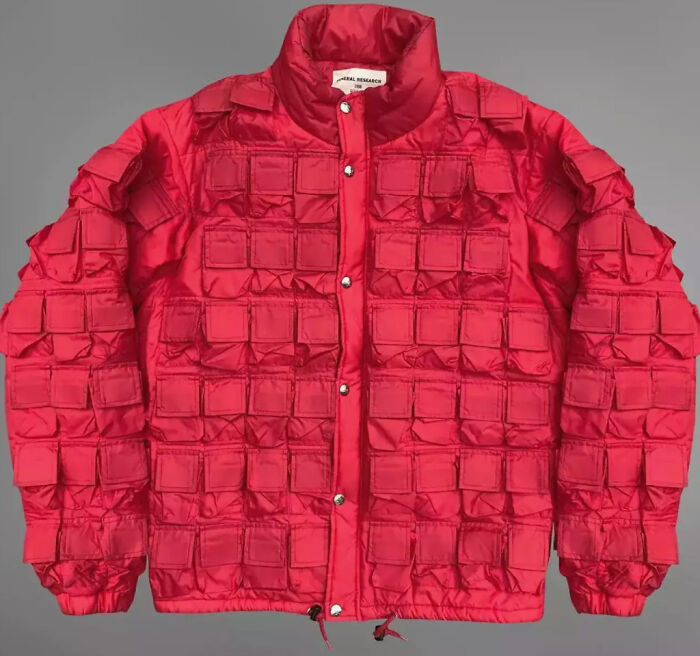
Image credits: braveNewWorldView
#26 A Balcony Without Sun Or Fresh Air Is Just A People Shelf
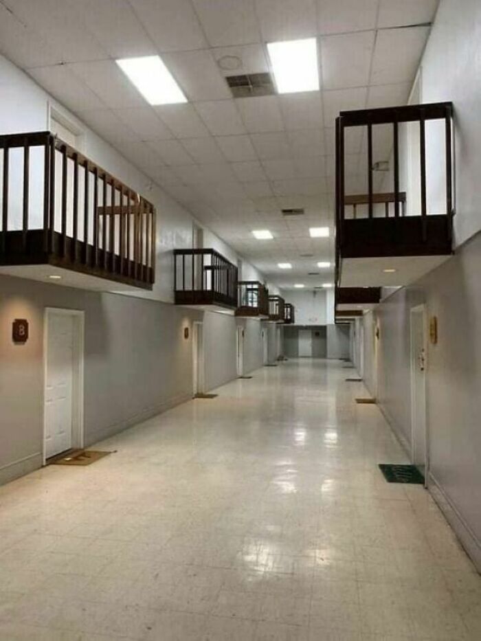
Image credits: WithaK19
#27 These Would Be Awful To Use
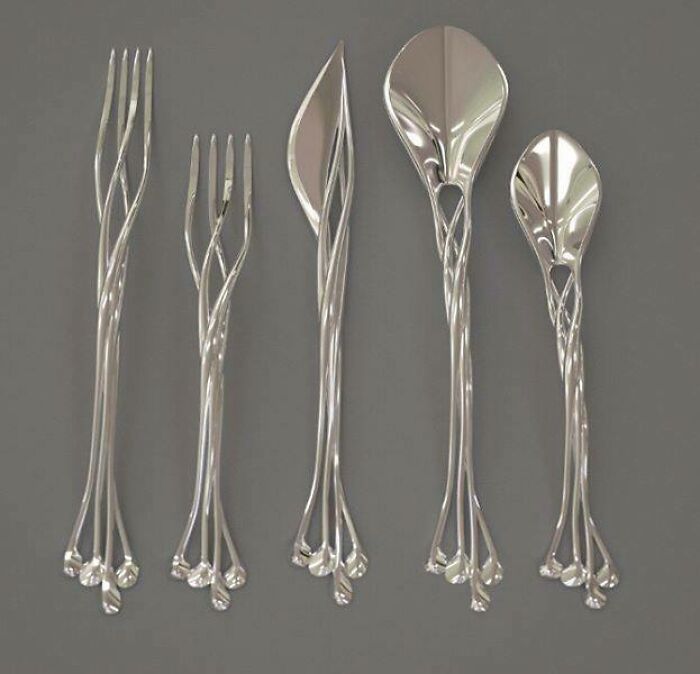
Image credits: mossycavities
Broadly speaking, taste might be subjective (e.g. preferences for minimalism or maximalism), but there are many things that we can agree on that do and don’t make much sense. If a product is user-friendly, ergonomic, intuitive to use, and matches our expectations, then we can say that it’s an example of good design.
#28 Oh Yes, Reverse-Lamp
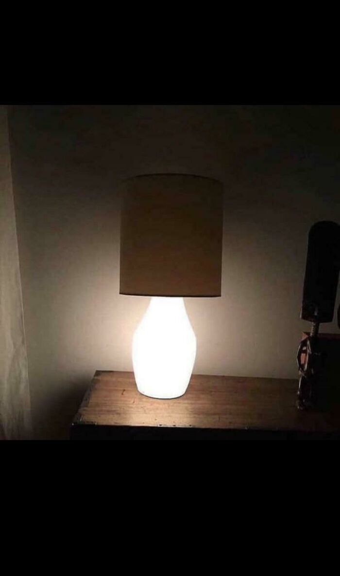
Image credits: Matuteconsuaj
#29 Splash-Proof Urinals
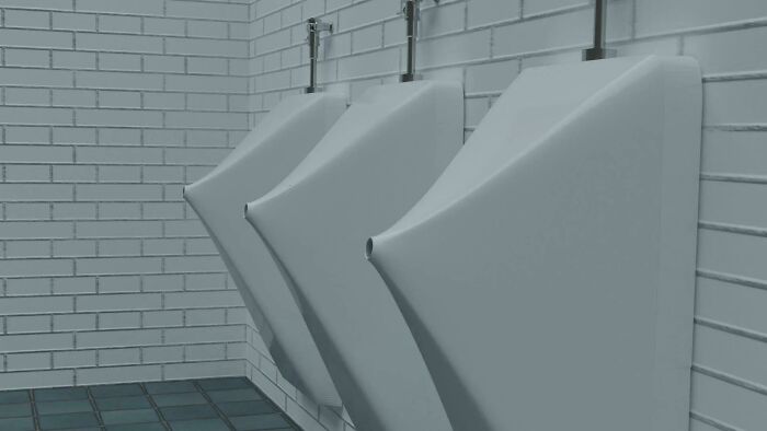
Image credits: Ok-Antelope9334
#30 This Hallway Must Have Looked Awesome On The Blueprints
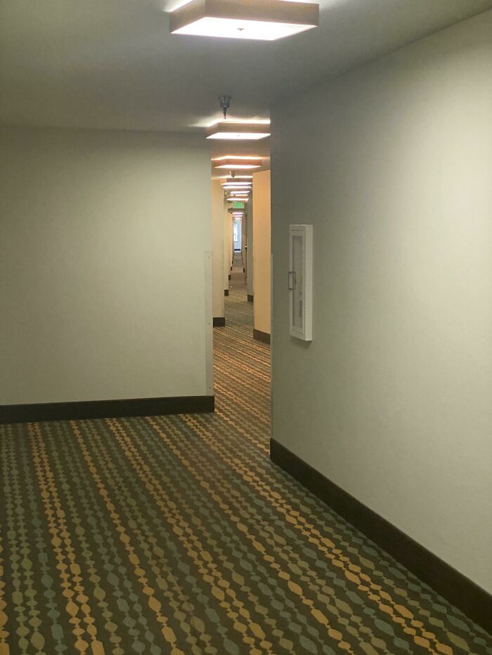
Image credits: mcwiggin
On the flip side, something that’s more like a puzzle that requires an IQ of 160 to figure out won’t get many smiles from the crowd (unless they bought it specifically because they love over-designed, over-complicated stuff). Put the user first and you can’t go wrong. Put your designs above them and you might end up in the grey zone where quality and awful taste meet.
#31 Does This Count?
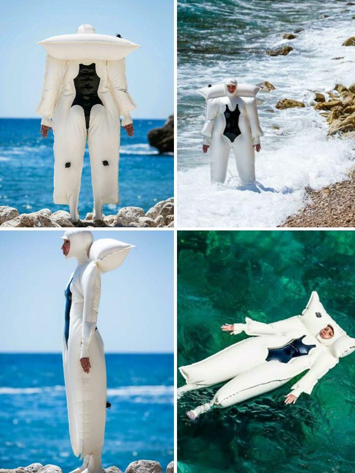
Image credits: DavyBoyWonder
#32 This Fire Pit That Doubles As A Side Table When You Tip All The Ash On The Floor
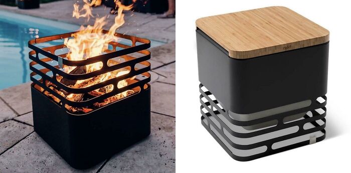
Image credits: OhoBenderez
#33 When You Want The Guarantee Of A Broken Neck From Your Staircase
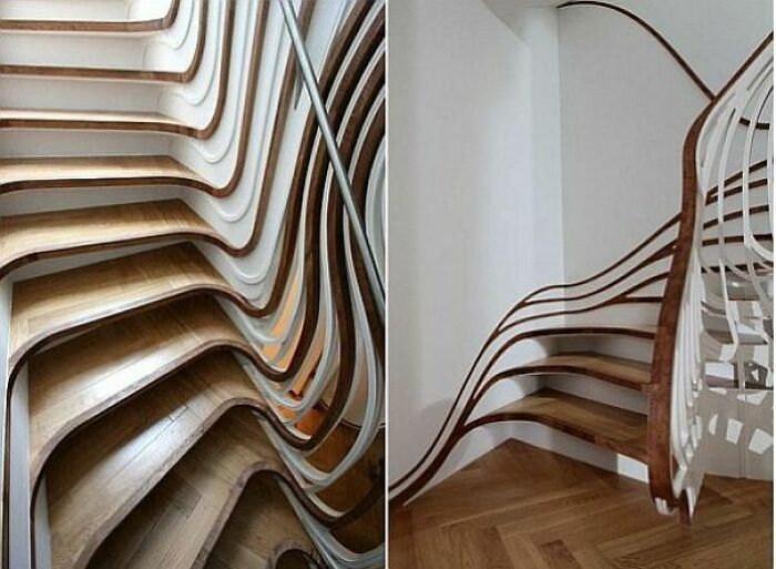
Image credits: Helpful-Substance685
#34 For Me, The Juicy Salif Is The Pinnacle Of Design Design
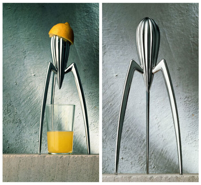
Image credits: Willch4000
#35 Reinventing The Pint
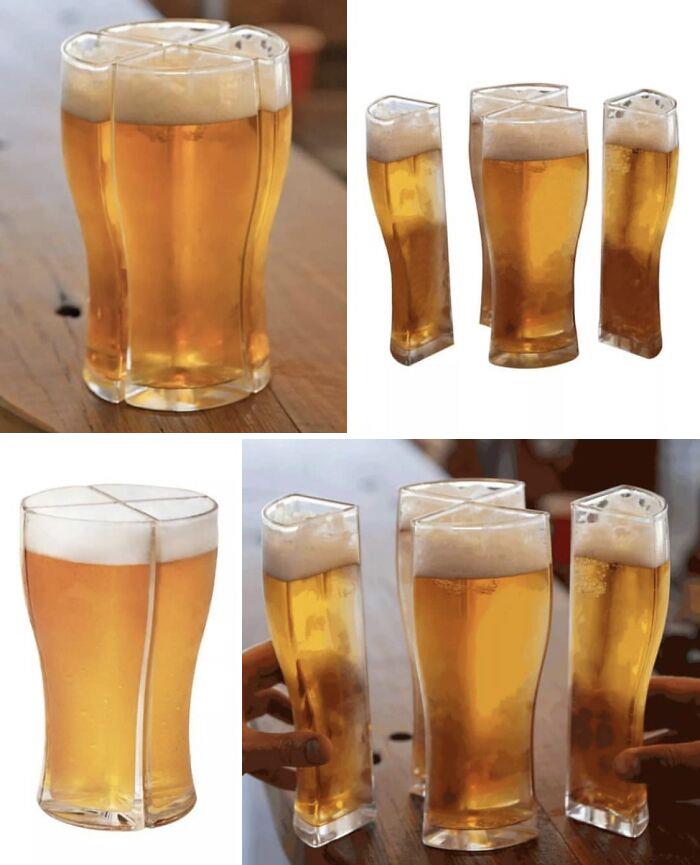
Image credits: zeph_yr
#36 Why? Just Why?
Image credits: MIRIIE
#37 Thanks I Hate It
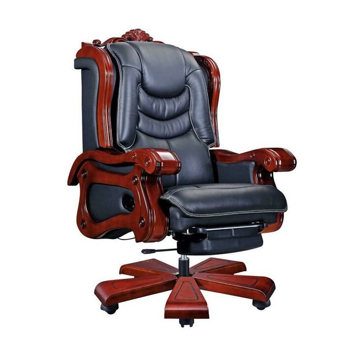
Image credits: Tacklefina
#38 W Fart Free Water
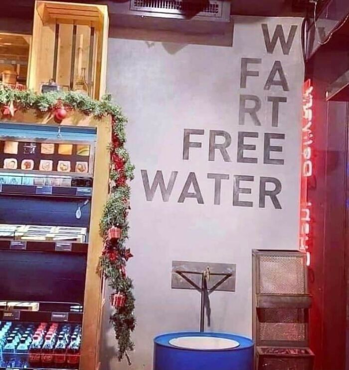
Image credits: 20-CharactersAllowed
#39 Because A Hat Would Be Far To Complicated
Image credits: echis
#40 The Lucky Knot Bridge In China
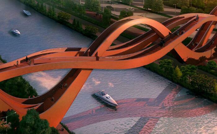
Image credits: reliseak
#41 Clocks
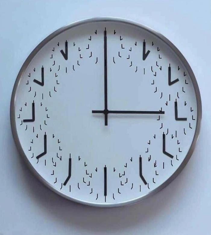
Image credits: jesset77
#42 A Bookshelf To Store Some Pebbles Or Something
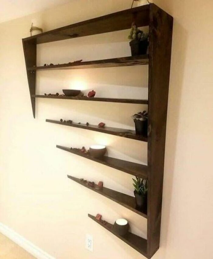
Image credits: 2roK
#43 This Sink. Spotted On A Facebook Ad
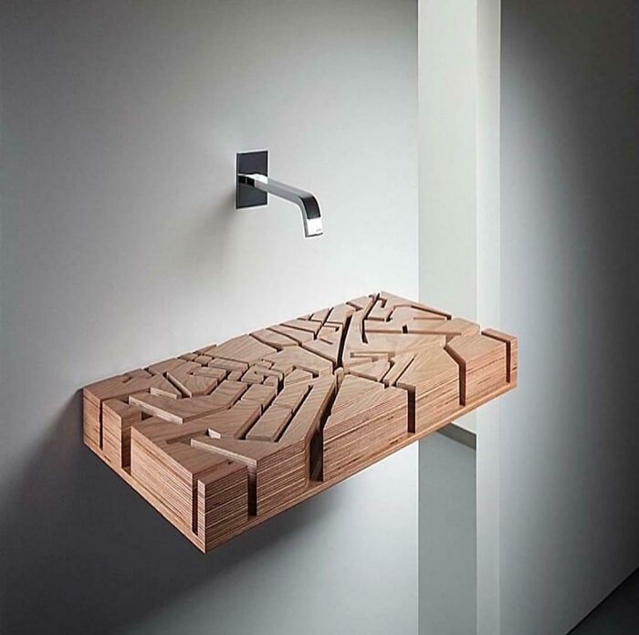
Image credits: reddit.com
#44 This Luxurious Toilet
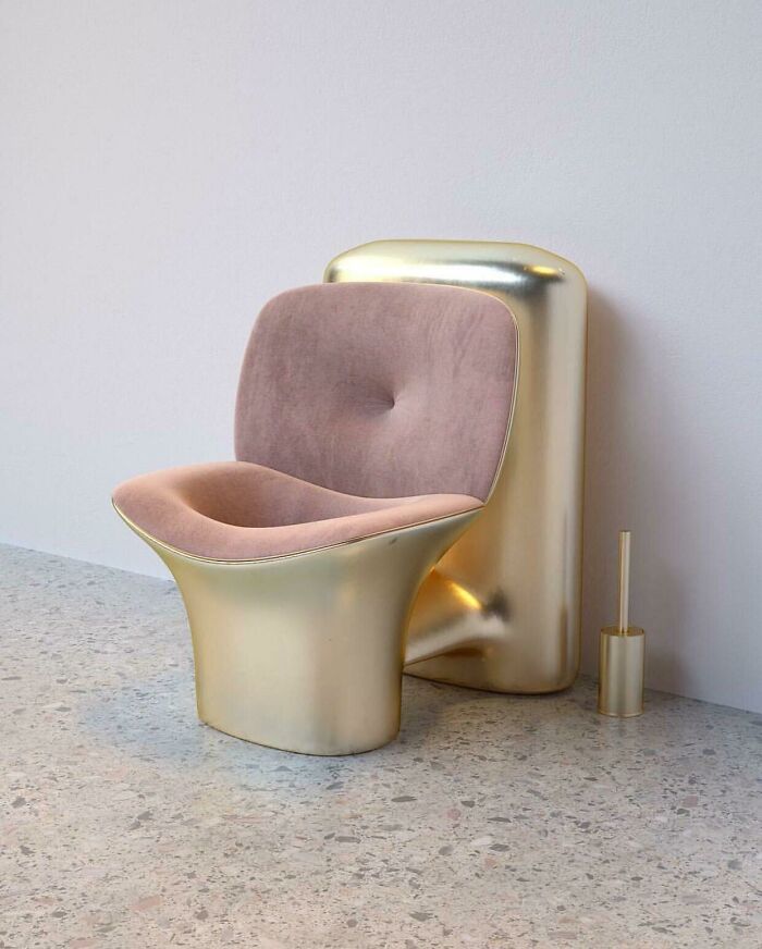
Image credits: markkobarr
#45 Love Designy Cumbersome Roundware
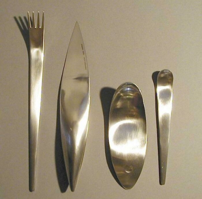
Image credits: Used_envelopes
#46 Dear God I Just Needed To Pee
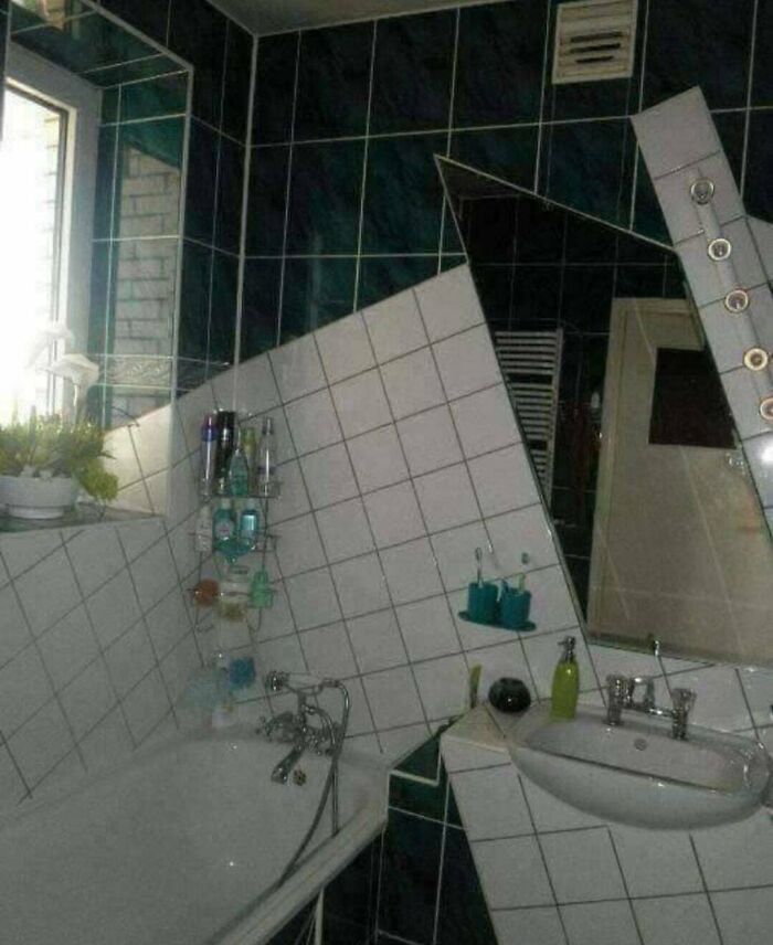
Image credits: mastermithi29
#47 A Maze Of Concentric Circles On The Back Of The Phone Fitting Its Earphones Perfectly
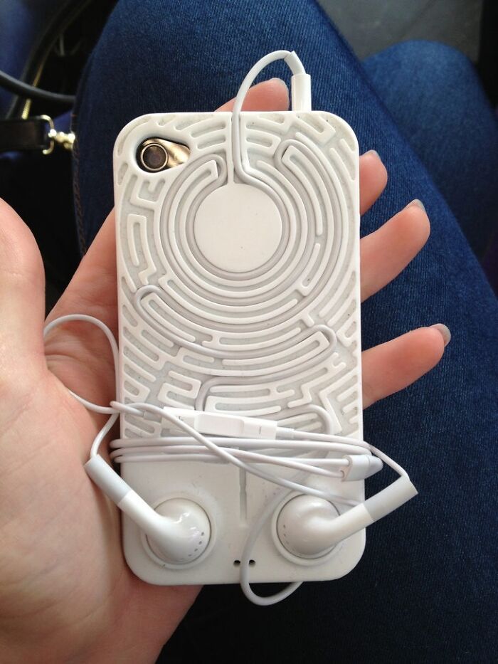
Image credits: airkiko
#48 That Looks Comfortable
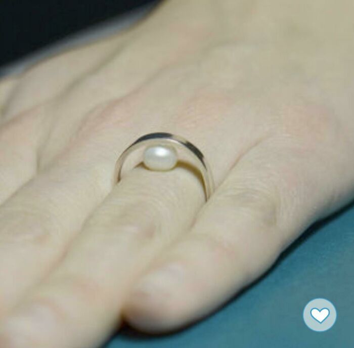
Image credits: ffrsh
#49 Stock Market Bench
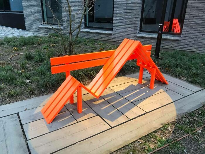
Image credits: joshart
#50 Saw This On Insta
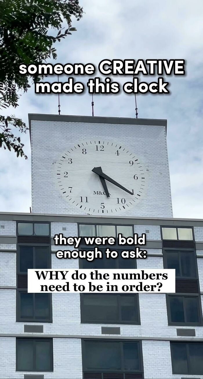
Image credits: paulekas_
Go to Source
Author: Mindaugas Balčiauskas