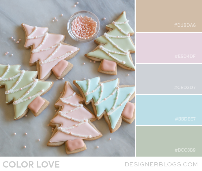
Oh my goodness, don’t these cookies look delicious? This pretty pastels color palette uses soft and muted colors, including blue, green, and pink. When used in web design, it can create some of the most elegant designs. It is a combination you must check as graphics that use washed-out, desaturated colors appear clean and light and are amazingly easy on the eye.
Pretty Pastels Color Palette
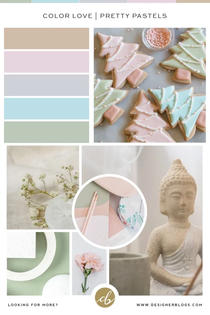
It is our second in a row color palette featuring some pastel shades but I think such soft colors are great for winter. Below I have created for you a simple mood board featuring today’s color combination. It is in perfect Pinterest format, so feel free to pin it for later.
See our collection of other gorgeous color palettes by visiting our color palette section.
What do you think about our pretty pastels color palette combination? Where would you use it? I think it will look great both for interior design and digital arts. There are really no limits here. I believe that soft pastels may be worn even during wintertime when paired with the classic beige color.
We would love to hear your thoughts, so make sure to share them in the comments below.
Lastly, learn about the power of color in blog design in our blog post to see how important colors are in all the projects you create.
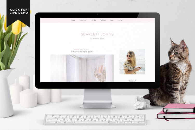
If you like pastel colors, make sure to check our Blogger Templates where you will find lots of pastel shades like blue and pink.
There is simply no shortage of design possibilities when it comes to bringing this pretty color palette to life. We even use some of them in our planner!
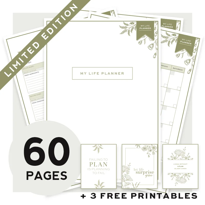
Life Planner
(pastel green)
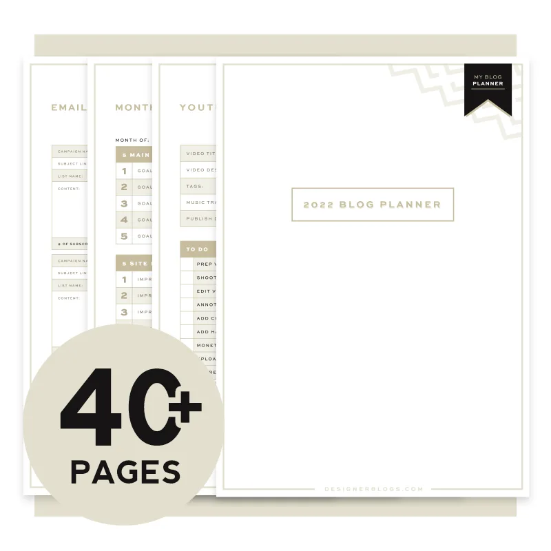
Blog Planner
(pastel brown)
If you create something using today’s color palette don’t forget to share it with us!
The post Color Love | Pretty Pastels appeared first on Designer Blogs.
Go to Source
Author: Kate