Including graphs and tables in your articles, blog posts, or even ebooks is always worthwhile.
They add terrific visual content to help you quickly explain data, statistics, or comparisons.
You won’t use them in everything you write. But you probably have lots of opportunities to include charts, tables, or graphs in your new or existing content.
Best of all is that these types of visuals have great SEO value.
How to create graphs and tables
When you think of graphs, Microsoft Excel probably comes to your mind immediately. But it’s not the easiest charting software to learn how to use.
I must admit that I find Excel quite challenging, so I rarely use it.
There are lots of online tools you can use, including some that are free. So you have lots of choices.
However, for the examples in this article, I used Apple Numbers. If you are a Mac user, it’s a free program like Apple Pages.
What I like about Numbers is that it’s so easy to use. You only need to select the charting basics template, fill in your table data, and select a graph style.
Another benefit is a nice little trick that I discovered.
When you are happy with your graph, copy it and open the Preview app and select New from Clipboard.
Then you can save your graph in png, jpeg, or pdf.
But whatever tool you use, try to make your graphs and charts as visually appealing as possible.
Let me show you some examples.
1. Using pie charts for percentages
When you divide a whole into parts, a pie chart is one of the best choices.
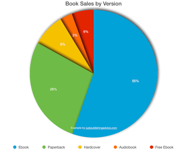
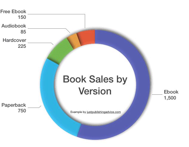
Here are two examples using book sales by the versions sold.
The first is a representation of the breakdown by percentages.
But if you want to show your data by unit sales, an open donut pie chart might be a better choice.
You can choose to add the numbers to the chart or have fly-outs, as in my example below.
These are useful when a pie slice is too small to show a number.
When you add graphs, always remember to add information in text form before or after your graph.
You could say that while most of your sales come from ebooks, paperback sales are more profitable.
Perhaps you could add that you have reduced your free ebook campaigns, but audiobook sales are increasing.
One other little tip.
When you publish a graph or chart, add a credit line to help identify you as the source when people copy or share your graphic.
It is also a great way to help you get backlinks from your images.
2. Column charts for progression
One of the most common types of graphs you see is columns.
The reason is that it is so easy to understand at a glance.
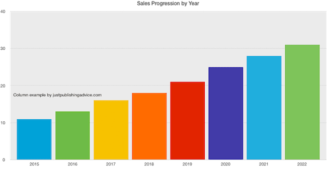
Here’s an example of a simple column graph showing annual sales progression.
It is the type of graph I used when I updated one of my articles about the number of Kindle ebooks on Amazon.
I added a few new paragraphs and a revised and updated column graph.
The result was an almost immediate (well, about ten days) jump in Google Search ranking for the page and keyword.
Another bonus was on Google image search.
My new graph appeared within a few days.
You can see that my original graph is still ranking in the number one position. But my new chart is at number four and will probably replace my old version over time.
From this example, it’s easy to see the value and benefit of including charts and graphs in your content.
3. When to use tables instead of graphs
Sometimes you have too much data to create a chart or graph.
It’s especially so if you have three, four, or more data series and columns.
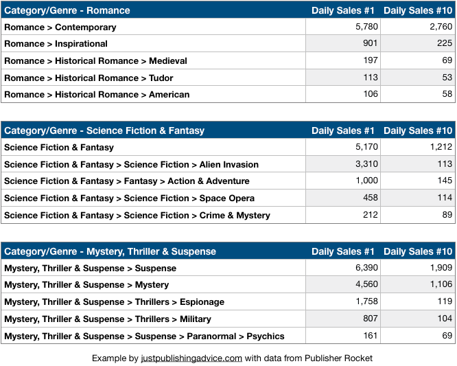
In the example below, I collected data about how many daily book sales it takes to reach number one and number ten on Amazon by genre.
Even though I restricted the genres to five, there is simply too much data to be able to create an easy-to-read chart or graph.
So the best way, in this case, is to use tables.
It only takes a few minutes to style and format tables to make them look appealing and easy to read.
Tip: If you access your data from an external source, make sure you add a credit line to identify your source.
4. 3D graphs and charts for visual appeal
When you want to create a graph that is a little more eye-catching, you can experiment with 3D graphs.
You can let your imagination run wild with this type of graph.
Generally, you want to show more of an overview than specific data points and numbers.
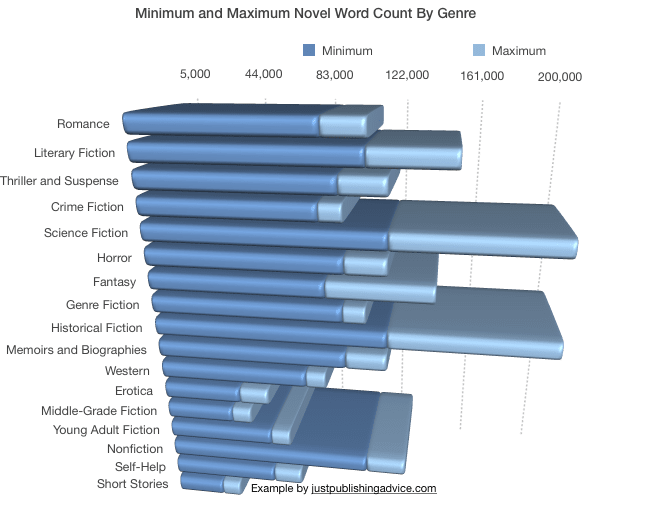
In this example, I want to show the approximate minimum and maximum word count statistics for novels by specific genres.
A stacked bar graph like the one above is an excellent way to show minimum and maximum values.
It is one of my favorite features of Apple Numbers because it is so easy to design graphs like this one in just a few minutes.
When to use tables and graphs in your writing
You are not going to suddenly use them in everything you write.
But when you are mentioning any type of comparative data, statistics, or trends, it’s probably a good candidate.
You could start by looking at some of your existing content to see if you have any posts or articles that could benefit from an update and the inclusion of a new graph.
You might be surprised by how well it will work to improve the search potential of your articles and posts.
Search Engine Journal mentions this fact about the benefit of using visual content to get more links and shares.
Of all the information that is processed by the brain, 90 percent of it is visual!
Yes, you can also use images, screenshots, videos, and gifs.
But what about infographics?
For a while, infographics had a reputation for having great SEO potential. But I think they have far less value now.
Usually, they contain way too much information and are often too big to view on a laptop or smaller screen.
I believe that charts, graphs, and tables are much better because they are smaller and can deliver information faster.
Summary
You always want to find or attract more readers when you publish your articles online.
The proven way is to get people to share your content on social media or add a backlink to their blog.
Both of these actions will have a positive effect on your search engine ranking to help you get more organic traffic.
Because charts and graphs are visual, they are absolutely ideal for sharing.
Next time you quote some numbers or data in an article or post, think about making it visual with either graphs or tables.
The post Graphs And Tables Add Extra Value To Blog Posts And Articles appeared first on Just Publishing Advice For Writers and Authors.
Go to Source
Author: Derek Haines
