“Unlock the Secrets: 9 Stunning Blog Designs That Will Transform Your Online Presence!”
This outline even features an animation that acts as a timer, letting you know when the slider will switch to the next featured article.
Beneath this slider are buttons presented in a grid layout with each button representing different blog categories.

The next few sections promote the brand’s content in different ways:
- Product Articles – A three-column, one-row showcasing of the blog’s latest posts on Linearity itself.
- Watch and Learn – A section to promote video tutorials from the Linearity Academy. It features a video background and three featured videos.
- Recent Articles – An archive of the blog’s latest posts. It features a large section showcasing the most recent post. This is followed by a three-column grid layout of additional posts with a Load More button giving you the option to reveal as many additional posts as you like.
- Creative Community – A call to action promoting the site’s community gallery, which showcases projects Linearity customers have used the tool to create.
- Get Started – A call to action promoting Linearity itself.
- Instagram Feed – A five-column, two-row grid layout of the latest Instagram posts published under the #linearity hashtag.
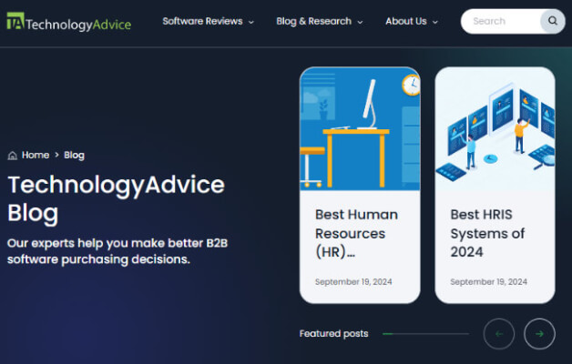
3. TechnologyAdvice

Primary Design Element: Featured post slider
