Unlock the Secrets to Pro-Level Blog Design: Start Impressing Visitors Today!
One approach is to design your blog for the smallest screen first, then work backward to expand your layout for larger displays. This way, you can prioritize what really matters and remove what doesn’t.
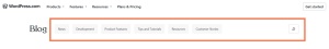
Here are a few things to consider when creating an intuitive mobile design:
- Touch targets: Look at the mobile reading experience and find all possible touch targets, like menu items, links, and buttons. These should have an adequate size and spacing. Make them at least 44 x 44 pixels with sufficient spacing to prevent accidental taps.
- Content width: When lines are spaced too far apart and text is broken up, it disrupts the reading flow. If lines are too cramped, they can seem too cluttered. Aim for 30-40 characters per line to hit the sweet spot without constant scrolling.
- Typography: Resize your fonts for small screens and increase the line height by a few points to improve readability. As a best practice, avoid picking fonts with thin strokes that might not be easily visible on mobile displays.
- Visuals: You’ll also need to resize images for smaller screens, from hero images to inline graphics. Check how images load in spotty connections or when you switch between different apps—this is a good way to discover usability problems on your site.
Besides creating a delightful reading experience, a responsive blog design can also improve your performance in search engines.


